ABOUT ME

Hi, I’m Ron, a Senior UX Designer and Strategist.

I am a design professional experienced in helping Federal, Government, and Corporate enterprise organizations successfully achieve their UI/UX software development goals by designing intuitive interface solutions that solve complex interaction problems with simplicity and style.


“A successful design will support quick action by prioritizing brevity.” - Nielson Norman Group

MY WORK

How I use design to solve problems.


DRAGON
Army

DRAGON Army UI/UX Product Suite Overhaul

Overview

  • Project: Facilitate a complete UX overhaul and rebranding of all DRAGON Army (DA) projects to establish a unified visual identity and cohesive user experience across an ecosystem of 10 individual applications.
  • Context: The Air Force Research Laboratory (AFRL) established the DRAGON (Defense Readiness Agile Gaming Ops Networks) Army Operations to revolutionize the way the DoD (Department of Defense) develops, validates, and integrates a mission-relevant space operations suite of applications for the space warfighter.
  • Role: Sole Senior UX Designer / Strategist collaborating with 24+ developers across 10 disparate applications.

Challenge

  • Create a new interface design and uniform UX functionality for all DA applications
  • Primary Pain Point: DA applications share no common visual identity or interactivity.

Goals

  • Develop a design strategy and visual direction supporting continuity of theme and functionality.
  • Apply established UX design principles and best practices.

Project: Mission Management Board

Overview

  • Project: Streamline the workflow of the DA Mission Management Board (MMB) application by consolidating separate displays of an events overview screen, detailed event data, and an external chat app into a comprehensive, intuitive single-screen dashboard of satellite orbital data.
  • Context: The MMB is designed to coordinate assessments and analysis of commercially available space object positional data. Through this interface, the Joint Task Force Space Defense Commercial Operation (JCO) cells can pass information and products related to events they have categorized, derive products from that analysis, and chat about processing and preparing the information for a Notice to Space Operators (NOTSO).
MMB overview display with satellite events presented in an easily readable row format on the left with a chat function incorporated on the right.
MMB showing an event selected with the corresponding data details expanded below in a scrolling format, allowing the user to add/edit/delete information within the event.
Complete view of expanded satellite event data details with corresponding Add/Edit/Delete modals.

Project: Mirkwood

Overview

  • Project: Design a single tool for satellite event simulation and visualization by streamlining the data entry workflow and incorporating a third-party interactive 3D map application that allows simulated satellite trajectory data to be rendered in real-time.
  • Context: Mirkwood provides DA Event Creators and the Global JCO Training and Exercises Teams the ability to easily input satellite events data and simulation scenarios of varying complexity into the DA/JCO simulation ecosystem as part of the JCO's sim-over-live environment.
Mirkwood main screen reflecting a variation of the MMB multi-panel layout showing satellite simulation scenarios and events listed on the left with a row selected and details expanded.
The right shows a third-party interactive 3D mapping app where entered satellite simulation data entered on the left will be rendered in real-time.

Project: Gaze

Overview

  • Project: Redesign and refine the presentation of satellite observation data into a unified, structured display format of observed satellite events to help teams understand what was observed, when, and by which platforms/sensors to support post-event analysis and coverage assessment.
  • Context: Gaze is a mission-driven satellite observation informatics tool supporting Space Domain Awareness (SDA) by equipping SDA teams with high-integrity, operationally relevant data that brings together satellite custody status, sensor collection availability, and differential detection capabilities into a unified operational interface, delivering critical information for situational awareness and mission refinement.
Gaze main screen designed with a unified, structured display format of observed satellite events presented in a uniform color-coded timeline.

End Results

  • Reusable layout templates, common UI elements, and a unified continuity of theme and functionality allowed the development team to easily implement design revisions and usability improvements, resulting in a successful rebranding and new visual identity across the entire DRAGON Army ecosystem of applications.

Integrated
Range
Information
& Status

IRIS Exclusion Zones Safety Map

Overview

  • Project: Design an interactive visual representation of mission launch exclusion zone coordinate data for display on a launch range area safety map and generate the corresponding launch notification documents for distribution to local authorities.
  • Context: The Integrated Range Information and Status (IRIS) product is a web-based application providing situational awareness and range operations support by offering an efficient process incorporating visual geographic overviews of live data necessary to plan, track, and execute vehicle launch missions for the Eastern Range (Cape Canaveral SFS) and Western Range (Vandenberg SFB).
  • Role: Senior UX Designer / Strategist collaborating with 2-4 developers.

Challenge

  • Design an onscreen presentation of all exclusion zones related to a mission launch and generate all necessary notification documentation.
  • Primary Pain Point: The current method of manually entering data into the system is inefficient and introduces the potential for user input error, resulting in inaccurate displays and faulty notification data.

Goals

  • Reduce Input Errors - make it easy to use
  • Reduce Time on Task - make it fast

User Research and Sketches

  • User research informed functional requirements and concept sketches helped maximize limited real estate on the Exclusion Zones side panel.
Sketch focusing on maximizing available panel real estate.

Solution

  • To reduce user input error, all launch notification documents were refactored into digital templates that allowed raw exclusion zone coordinate data to be uploaded into the application, the data parsed, and then inserted into the templates, which were then auto-generated into the launch notification documents in PDF form for distribution to local authorities.  
  • To reduce time on task, uploaded exclusion zone coordinate data was processed to automatically populate the Exclusion Zones Panel and render all exclusion zones on the range area Safety Map.

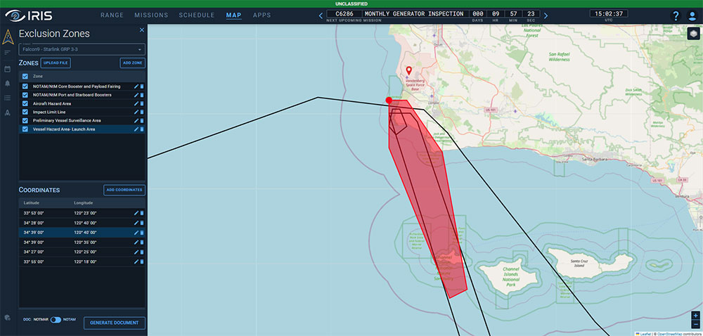
Exclusion Zone Panel and Safety Map displaying hazardous areas related to a launch.
The red area on the map indicates a selected zone in the left panel, and the red dot on the map signifies a selected coordinate point in the left panel related to the selected zone.

End Results

  • The design is a highly interactive Safety Map feature in IRIS that facilitates uploading and processing of launch mission documents to render and display area coordinates into an intuitive and comprehensive geographical overview of launch exclusion zones for land, sea, and air.
  • High-level interactivity allows the user to highlight, select, add, and delete any exclusion zone and/or corresponding coordinate points with real-time render updates.

BONUS: Customer Page

  • At client request, a Customer Page was created to focus on each individual Launch Service Provider (LSP), highlighting details including point of contact, company background, documentation, missions, and launch vehicles.
  • A clean design and template structure ensured uniform presentation of data across all LSPs.
  • The page was very well-received, with clients enthusiastic about incorporating additional features to expand functionality.
Customer Page detailing LSP information.

Total
Learning
Architecture

TLA Recommender

Overview

  • Project: Redevelopment of the Recommender application, an adaptive learning system that evaluates a student’s profile and stored learning activities in order to sequence delivery of ongoing learning activities based on the student’s learning paths and objectives.
  • Context: The Recommender was initially developed as part of the Total Learning Architecture (TLA), a cloud-based research and development project sponsored by the Advanced Distributed Learning (ADL) Initiative program of the Department of Defense (DoD). The TLA’s mission is to ensure the DoD’s education and training community has access to any training, anytime, anywhere, on any device.
  • Role: Lead UI/UX Designer with 2 Software Developers and a Product Owner on a Tiger Team assembled to investigate, identify, and solve usability issues with the Recommender within a 2-week timeframe.

Challenge

  • Redevelop the vendor-delivered Recommender application that failed to meet project requirements and usability guidelines.
  • Have the application designed, tested, and implemented within a 2-week sprint timeframe for a scheduled DoD demo.
  • Primary Pain Point: The interface confuses and misleads the student when choosing learning options, resulting in counterproductive actions and user frustration.

Goals

  • Improve the Usability
  • Define Clear Functionality
  • Simplify the Process

Usability Testing

  • Based on results from an in-house pilot test, an entirely new user interface was needed. This led to the redesign of the interface in 2-day mini sprint, exploring intuitive new navigation systems and fresh dashboard concepts.

Sketches

  • Because of the short development window, a Lean UX Process was adopted, with very short, iterative, low-fidelity cycles, with feedback coming from all members of the Tiger Team early and often.
  • Skipping wireframes and moving directly to mockups, the goal was to get the core components of the concept visualized quickly and in front of the team.
  • These steps allowed the team to understand the design and accelerate communication with the developers.
Sketches investigating horizontal and vertical scrolling formats.

Solution

  • Focusing on critical components of the user experience, the layout was reorganized to reduce navigational clutter so that content would be easy to find without the visual noise of unnecessary elements.
Final hi-res mockup of the re-designed TLA Recommender showcasing a vertical scroll format of available learning activities.

End Results

  • The result is a streamlined user interface with workflows optimized for efficient navigation, content locating, and performance of user actions within a system designed to adapt to the student’s needs and learning objectives.
  • Pushing the envelope for this application redo, the Recommender application was radically transformed, and the redesign was finished on time and ready for a successful demo with the DoD client.

Navigation
System
Maintenance
Trainer

NSMT Instructor Overview Station

Overview

  • Project: Design an Instructor Overview Station (IOS), a digital platform displaying real-time student performance data in an electronic classroom environment that is part of an integrated training solution for the U.S. Navy.
  • Context: The Navigation System Maintenance Trainer (NSMT) is a fully interactive game-based 3D virtual training environment for the U.S. Navy’s Center for Surface Combat Systems (CSCS). The integrated training solution consists of an electronic classroom with 16 student seats and 1 instructor overview station to teach Electronics Technicians the inter-relationships of shipboard navigation architecture.
  • Role: Lead UI/UX Designer on a team with 1 Software Engineer, 2 Database Programmers, and a Project Manager.

Challenge

  • Design and develop a comprehensive dashboard overview of a 16-seat electronic classroom that supports instructor task assignment and provides easy, drill-down access to real-time student-specific performance data.
  • Primary Pain Point: Navigation systems onboard U.S. Navy surface ships are made up of various components that obtain or distribute navigation data throughout the ship to multiple ship systems. Current training methodology approaches each system individually and does not present the technicians with an opportunity to train in a unified “system of systems” environment.

Goals

  • Define Clear Content Strategy
  • Design Intuitive UI Navigation
  • Minimize Workflow

Information Architecture

  • Since I joined the project after development had begun, I conducted a thorough analysis of guideline documents provided by the U.S. Navy to identify software requirements and actionable findings to inform clear and logical information architecture (IA).
IA diagram reflecting clear hierarchy and site structure.

Sketches

  • During ideation, it was realized that the majority of information being presented lent itself to a common visual format. This finding was leveraged to develop a core template structure for clear and unified presentation of data throughout the application.
Ideations leveraging the core template structure while exploring Inverted-L, Left Rail, and Top Bar navigation schemes.

Wireframing

  • Wireframing was explored to ensure that the core template structure supported the presentation of different types and volumes of data.
Wireframe of the core template structure with Inverted-L navigation.

Solution

  • Development reflects a visual experience that helps the user find what they need and identify relevant information and relationships while reducing the cognitive workload despite the amount of information being displayed at a given time.
  • Focus was on creating clear user actions and secondary/subsequent actions. Common actions are made available in the side rail navigation with buttons and actions clearly labeled and grouped. Detailed student performance data is accessed through the tab system located across the top.
Hi-res mockups of the IOS demonstrating effective integration of the core template structure.

End Results

  • The visual design supports clear presentation of data in a central format and reflects an intuitive UI navigation system that promotes the user’s ability to easily find content and confidently perform actions.
  • User testing feedback regularly included:
  • “Shallow Learning Curve”
  • “Extremely Easy to Use”  
  • “Very Intuitive”                  

Outcome / Comments

  • The NSMT was successfully installed at the U.S. Navy’s Center for Surface Combat Systems (CSCS) Unit Dam Neck, VA, and permits Instructors to oversee and monitor students in an electronic classroom as they operate in a 3D virtual environment to troubleshoot and repair complex shipboard navigation systems within the NSMT system of systems training environment.  See Navy News Article Here.
  • “The NSMT simulator will be the cornerstone of future navigation system maintenance training for many years to come.”
       - Capt. Len Remias, CSCS Dam Neck (VA), Commanding Officer

RON EINSLE © 2024       All material displayed on this site is intended for demo purposes only.